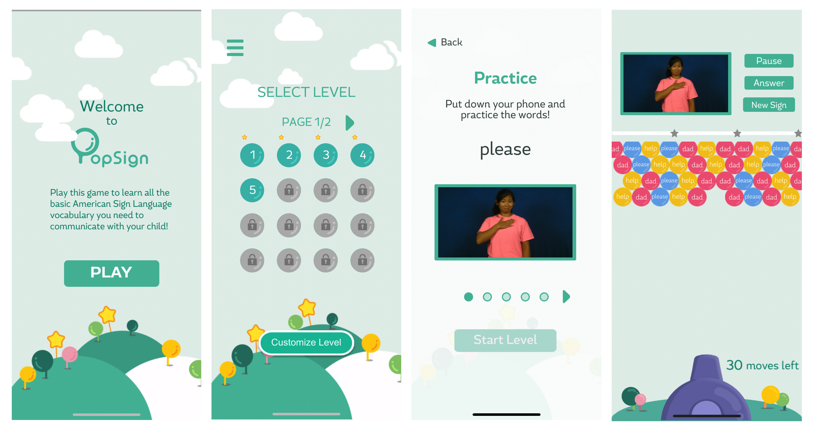

PopSign is a mobile game application that teaches hearing parents of deaf babies American Sign Language. 95% of deaf children are born to hearing parents who do not know sign language. Those deaf children are at risk of limited access to language early in life because they can’t hear spoken language and their parents do not know how to communicate. While there are no apps that use gamification to teach ASL, PopSign has been developed to create an easy way for parents to acquire sign language words and provide a solid foundation for their deaf infants to succeed in life.

During beta testing, the CAT team set out to improve the app, troubleshoot bugs, and gather user feedback to continue developing upon the release. User studies were conducted to gather feedback and to assess the effectiveness of PopSign. To create several iterations, the design was set up in Figma to easily apply changes throughout the process and to keep the gameplay consistent. Wireframes were also created to showcase additional features including game tutorials and scoring mechanics that integrate UI elements.
ROLE: UX Analyst / UX Designer
DURATION: 4 months
What is the problem? After several version of PopSign was released, user feedback has been gathered. One most common problem that appeared in those user tests, adults of deaf children often had a hard time understanding the gameplay and eventually stopped playing. The game app also had UI issues that needed to be worked through.
To improve the overall user experience, the evaluation of usability
and the app’s features has been conducted. I was assigned a task to
implement game tutorials that can enhance the player experience and
improve their understanding of gameplay. This process included user
studies that tested participants’ understanding of gameplay and scoring
and asked them about the game's functionality.
After conducting those user tests, the results provided useful insights
into possible solutions. The concern that PopSign showed was the lack of game flow.
To those first-time players who are not familiar with this gameplay, this current
version that does not contain instructions cause more confusion in how to shoot the
bubbles or understand the scoring mechanics. Participants also found the game confusing
as they expected feedback after shooting the bubbles. The second major finding was that
participants were frustrated with UI elements including the color palette and confusing buttons.
Game tutorials:
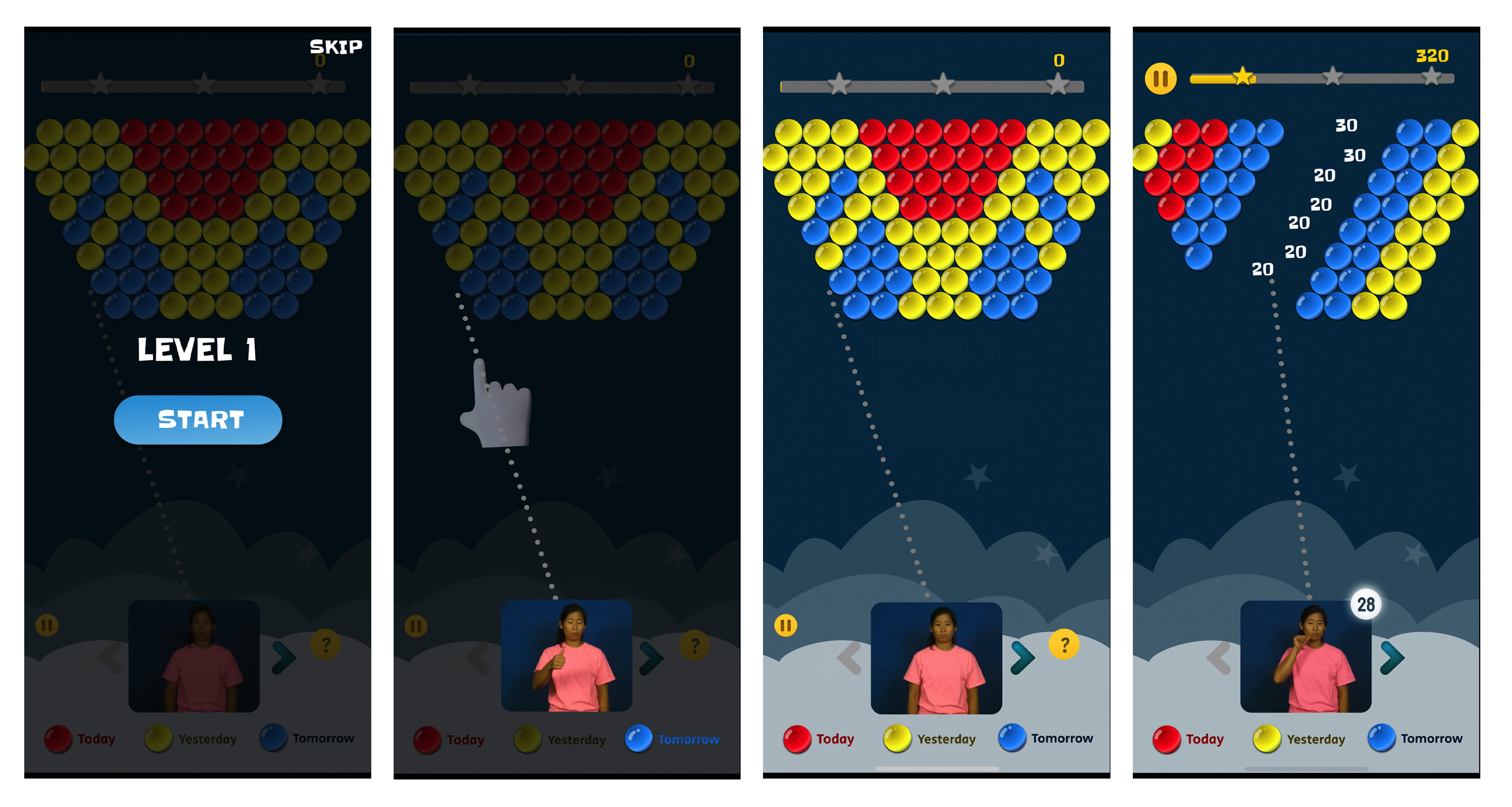
Introduce new content by adding detailed game tutorials to help first-time players
understand PopSign’s gameplay and scoring mechanics. These tutorials, consisting
of several ways to shoot the bubbles: drag to aim, bounce off the wall, and swap
the bubbles, are set at the beginning of gameplay seamlessly.
Redesigning UI aspects to improve the user experience:
Color palette: the choice of color matters when it comes to creating
an accessible application. Including accessible hues in this design, the specific palette
makes the game more usable and enjoyable to people who may have disabilities
like color-blindness or vision impairment.
Visual feedback: a feature of user interaction is important when it
comes to how information is given back to the users. As the players expect
something in return after shooting the bubbles,
visual feedback is a good way to let users know that they earn points.

Since PopSign is still in development, the work has provided a
foundation for it to create another game design. With my contribution
to the team, PopSign will be able to provide a better user experience.
New features outlined in the wireframes and user tests during my time
with the CAT team will improve usability and functionality
and possibly pave a way for new games.