


95% of deaf children are born to hearing parents and most of them do not know sign language. No early exposure to sign language prevents deaf children from receiving accessible language input. Having no foundation from an early age reduces the chance of building creative thinking, better problem solving skills, greater academic achievement, etc.
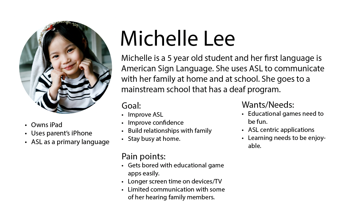
Our goal was to create a application for deaf children with hearing parents. To improve communication between parents and their deaf children, we sought a solution that will integrate the gameplay experience with sign language. It would have features that motivate children to learn and enjoy the playing experience. Not just learning, children will have an opportunity to take on a leadership role as they teach their parent sign language.
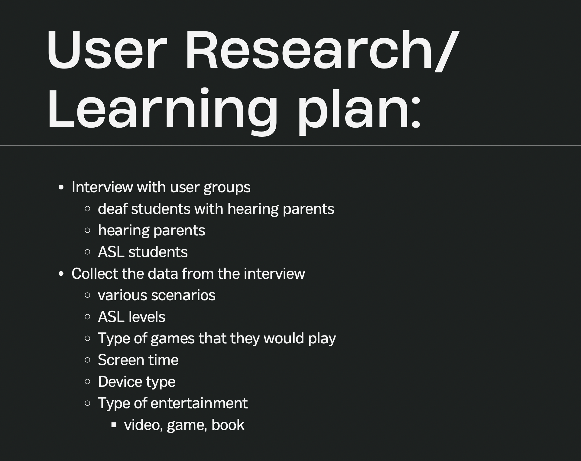
Before we got into research, we knew we wanted to do something with accessiblity for deaf children. Since we have witnessed communication barriers that deaf children faced with their hearing parents, we wanted to take further research into educational games that most children benefit. Based on our findings, there were not that many games that use American Sign Language (ASL). We began to explore educational games that most children would use at home or school. As we explored, we found that many apps did not offer any languages other than English. We noticed those apps were not accessible for children with their parents who speak other languages. So from there, we want to create something that provides full access for deaf children. That includes providing ASL video clips or any ASL centric content.
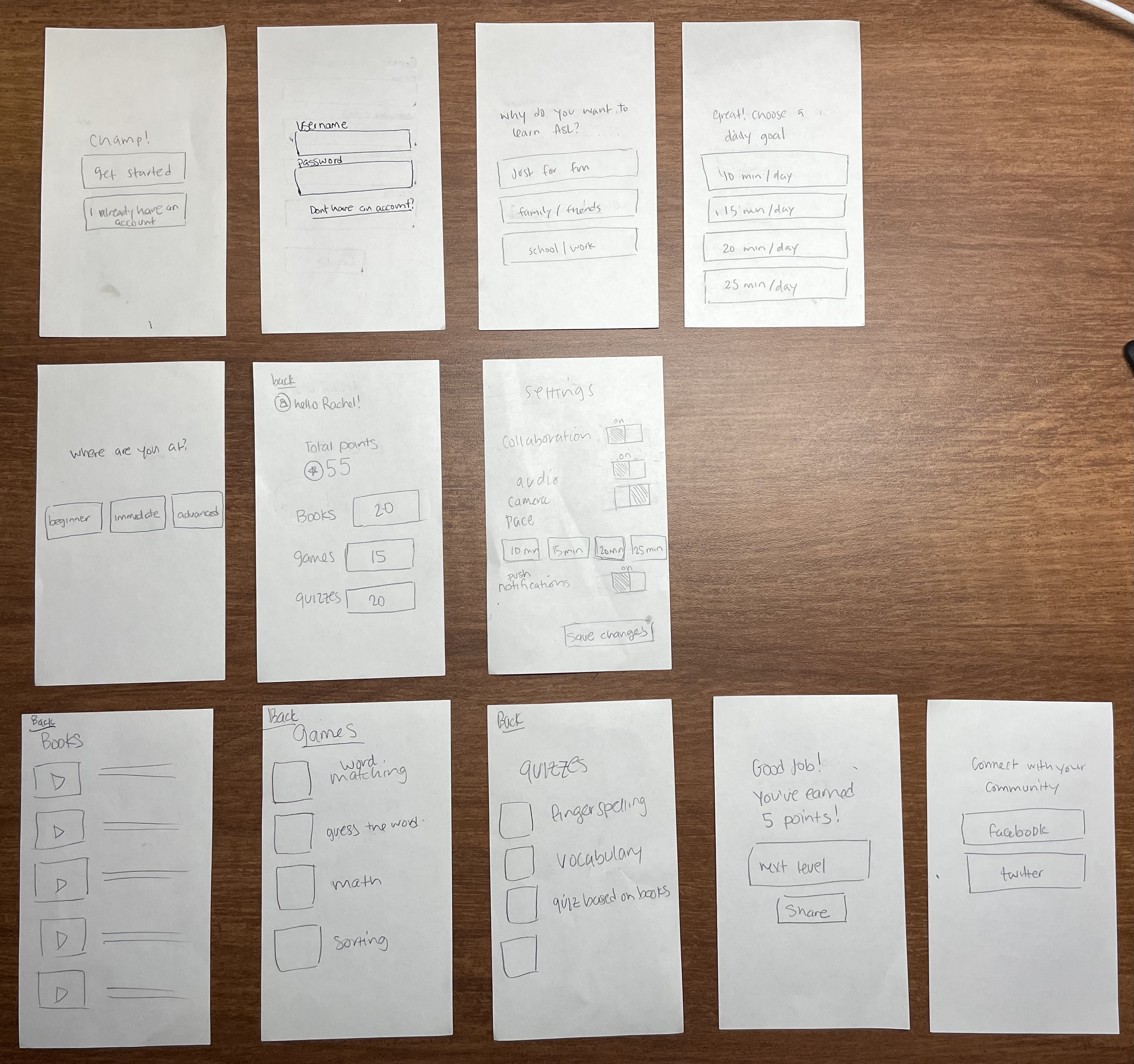
Task flow 1: Answering onboarding questions.
After creating an account, user was asked to answer
these questions so that the data will be sorted based
on their preferences.
Task flow 2: Passing all levels in the ABC category.
User was asked to pass all levels before moving on to the
next level. This part would ask user to copy signs that were
shown in video clips.
The goal for our testing was to get feedback on our user interface.
Whenever they became confused or hesitant to do a task,
we asked questions such as “what do you think you should do next?”,
“what do you think will happen next if you press X?” etc.
We carefully documented the breakdowns of each user while interacting
with the prototypes.
From the testing, we found many flaws in our app which led users
not to understand what they were supposed to do throughout the test.
Task flow 1: The biggest issue we found was that they asked if
they should set up for themselves or a child. Another one was that they
wanted to be able to customize time pace.
Task flow 2: When they were on a category page, they expected
feedback indicated to them not to click something that was locked or disabled.
Another big issue was that they were not sure if they signed right or not
there was no feedback.
As we transitioned our paper lo-fi prototype to a prototye so that
we could add interactive features for our users. Therefore, this
hi-fi prototype was designed on the computer using Figma, as it
allows for more flexiblity when we need to update the important
features or make any revisions to our designs.
Since we received feedback on user tasks from our lo-fi prototype, we had to
make a lot of revisions including removing some tasks
to our hi-fi prototype. After testing, we decided to remove some unecesssary tasks
to simplify the overall experience. We realized that our previous tasks
caused stress in users. The only two tasks we used for this hi-fi prototype
analysis: (1) log in and (2) navigation to the game category. Based on our
testing, we felt these particular tasks were the source to solution to
the task flows. We anticipated that these would help us pinpoint the task flow
obstacle.
Task flow 1: Logging in an account
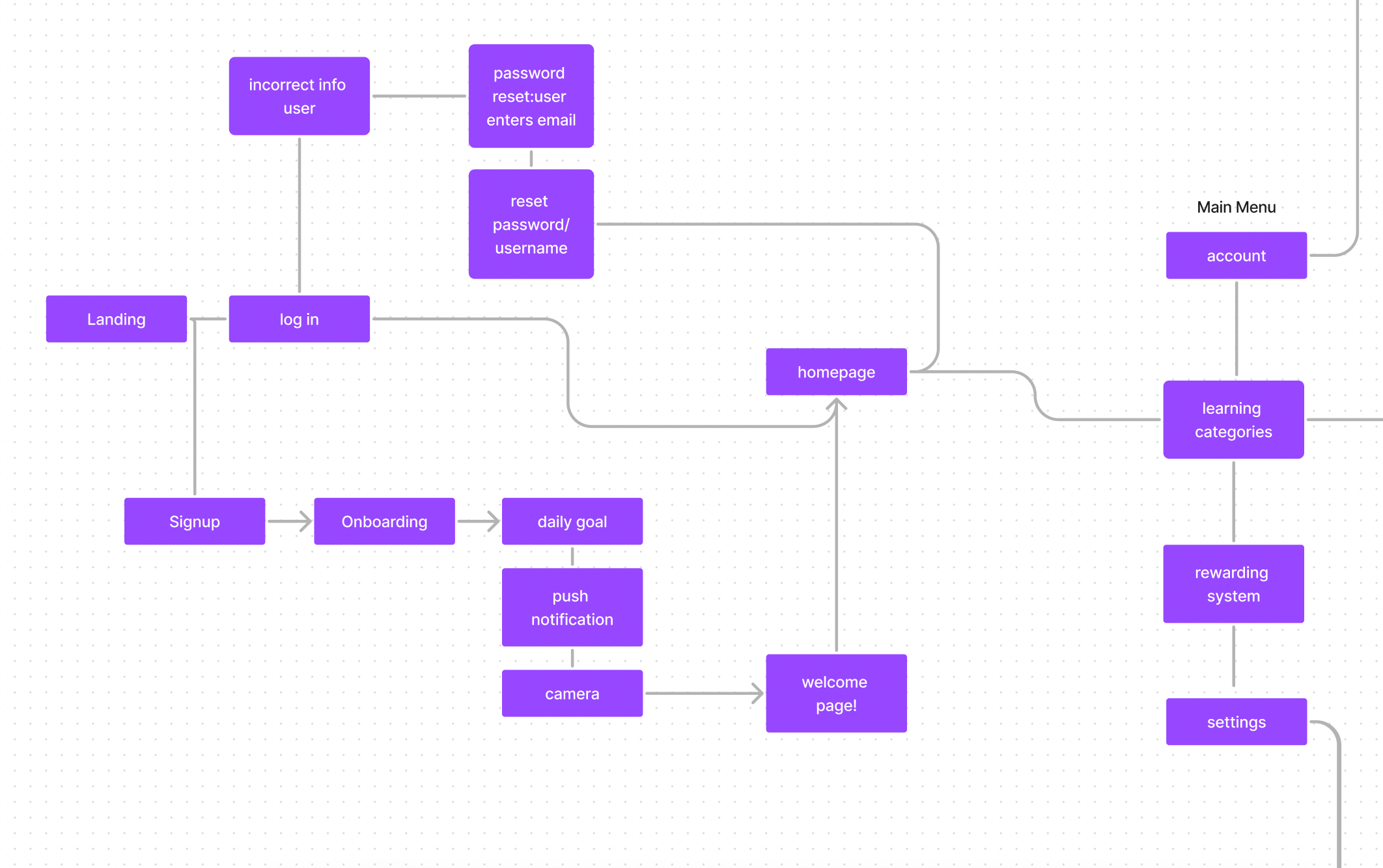
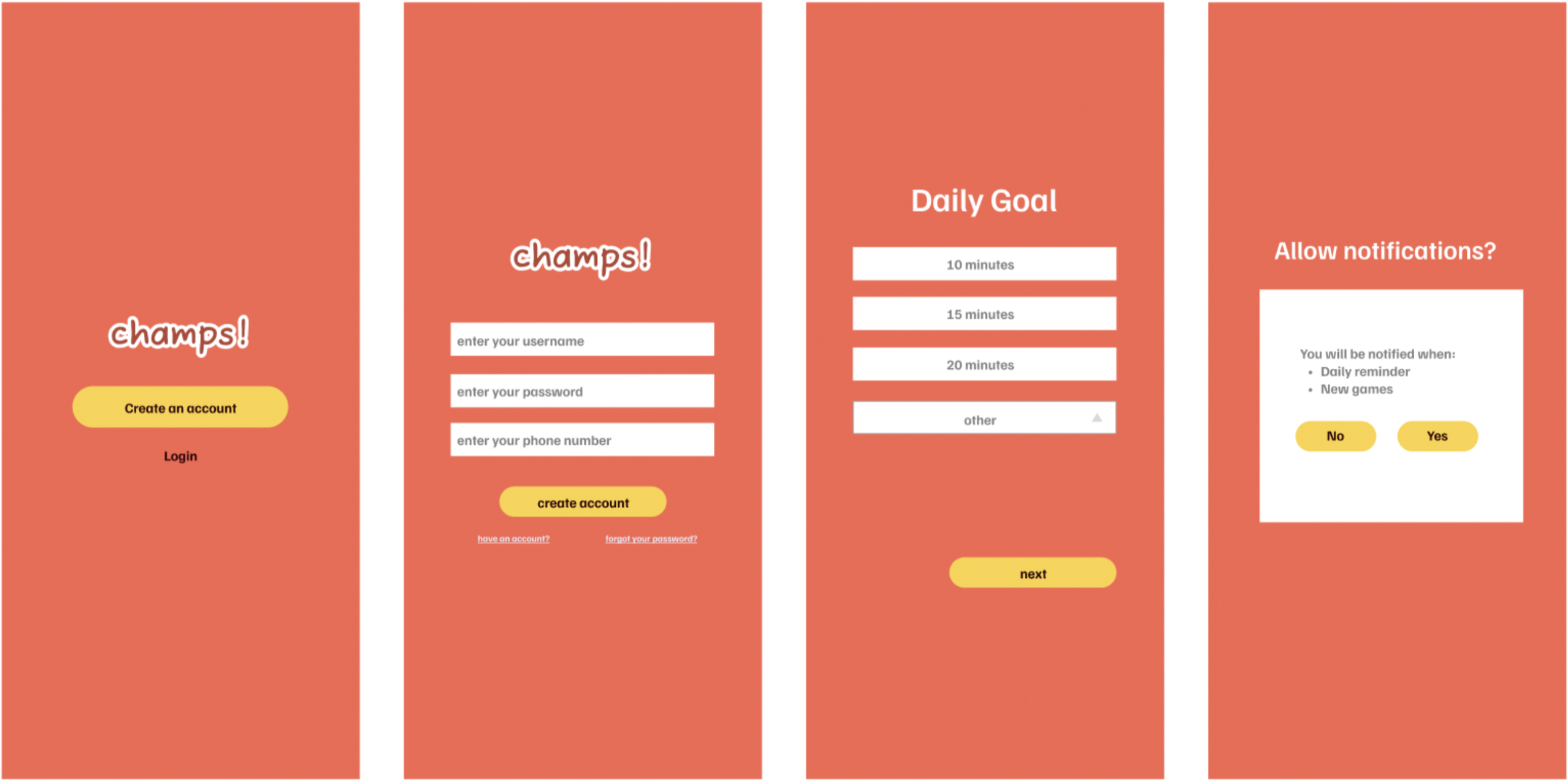
The purpose of this was to build relationship with users and allow them to make
customizations to their preferences.
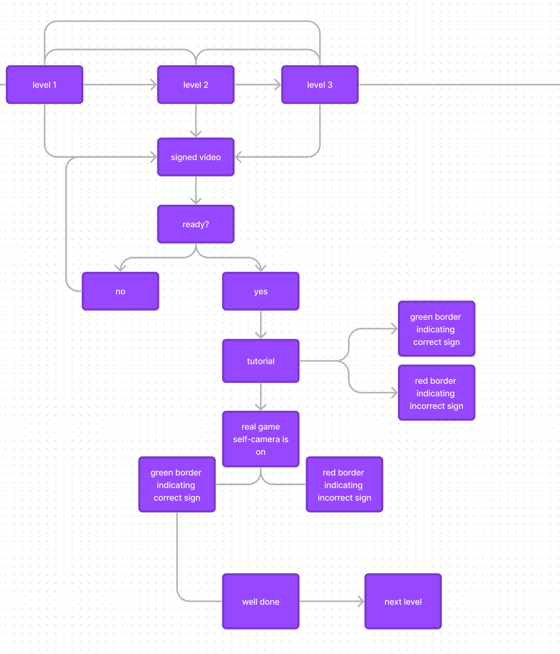
Tutorial:
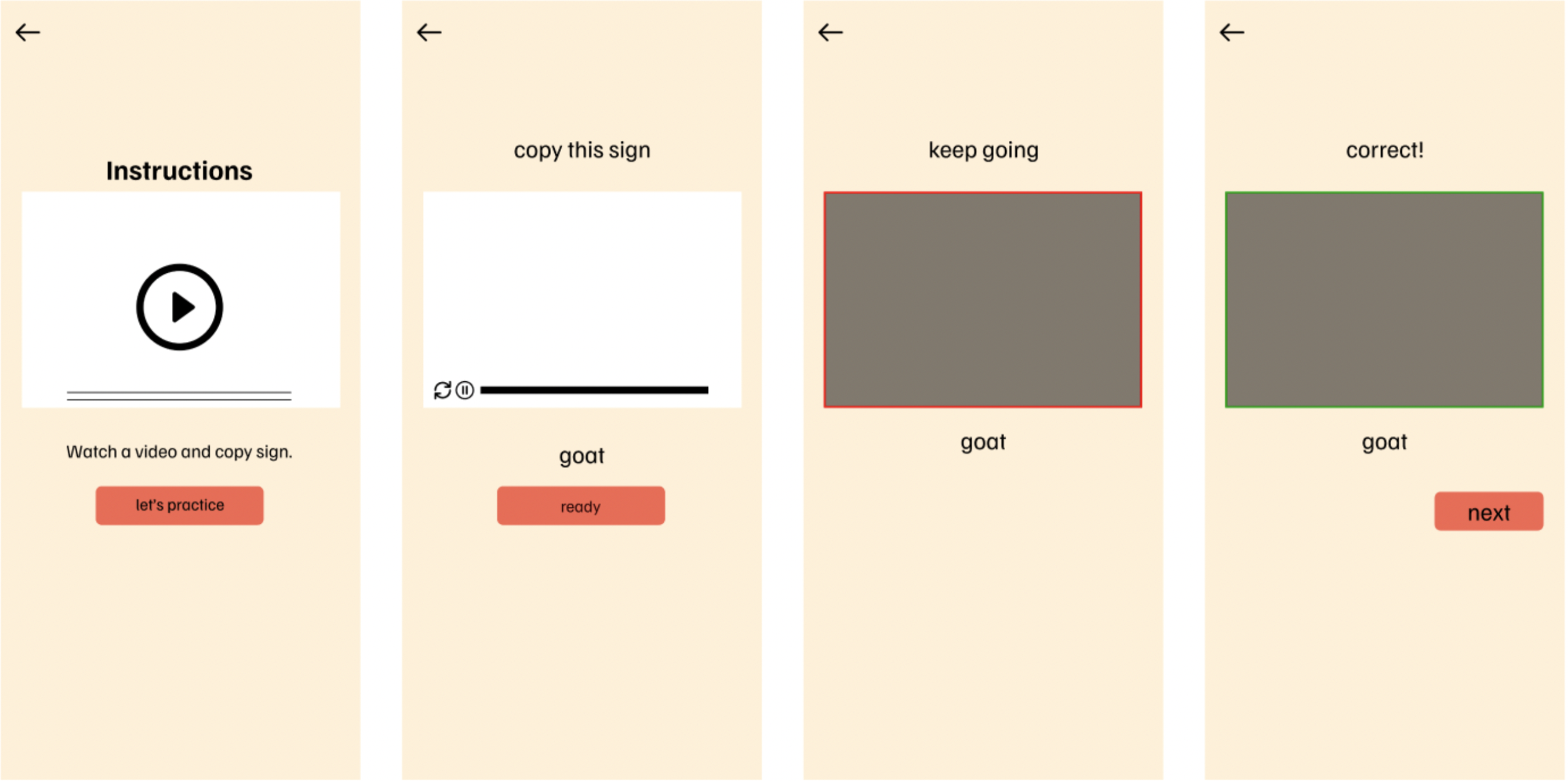 The purpose of this was to make sure users feel comfortable
and ready before jumping in the real game. This would teach
users how to play the game especially when it had sign
recognition which may be new to many.
Real game playing:
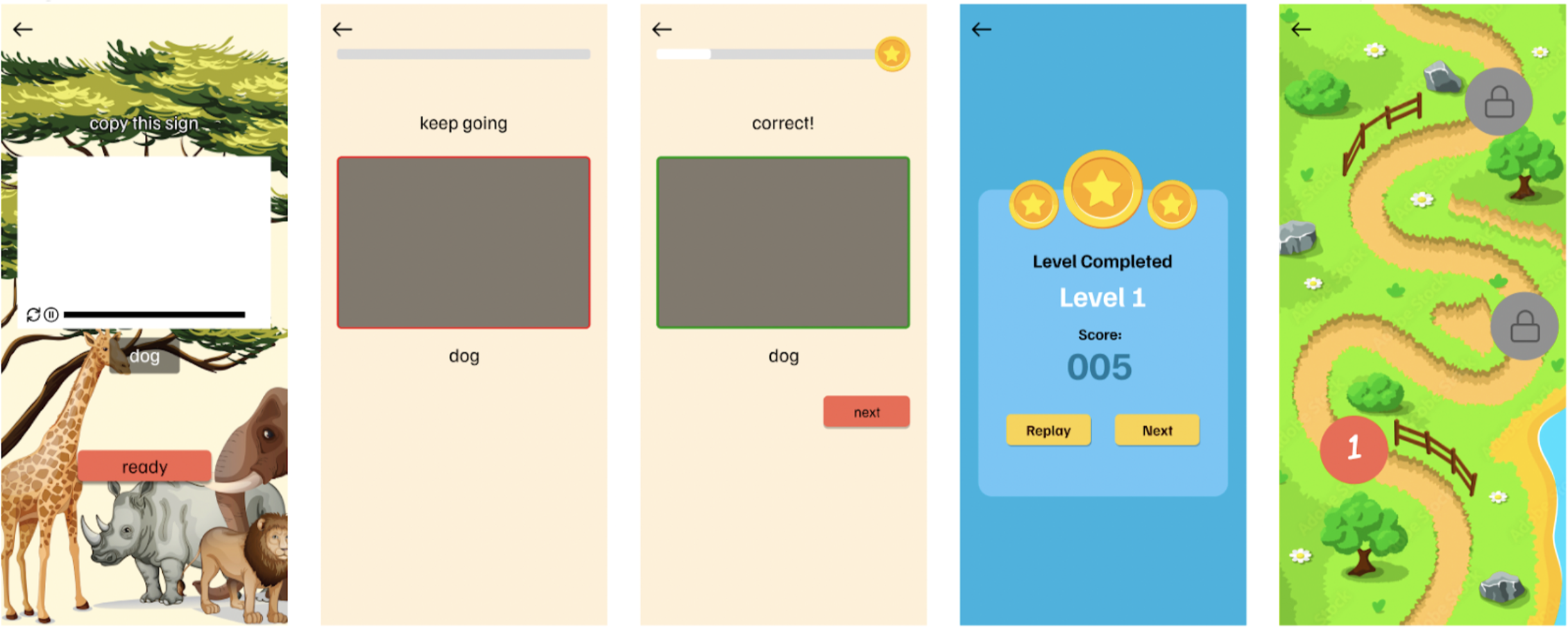 This is when users got to play the actual games. The game process
was similar to the tutorial part, but it did not include instructions.
In this part, we included a reward system (rewarding indicator and level completed)
and visual map of levels.
Our initial audience would be deaf children. But since we are college students with no transportation and were not able to see children off campus, we recruited 10 other college students who were friends or acquainted with us. Before we started usability tests, we explained this application and its goal to the participants. We emphasized that this was a prototype with interactive features, not an actual application. After having them doing tasks, we asked them to complete the rating. We used the ratings to generate severity ratings to measure the overall satisfaction experience with the interface and application itself.
Raw data
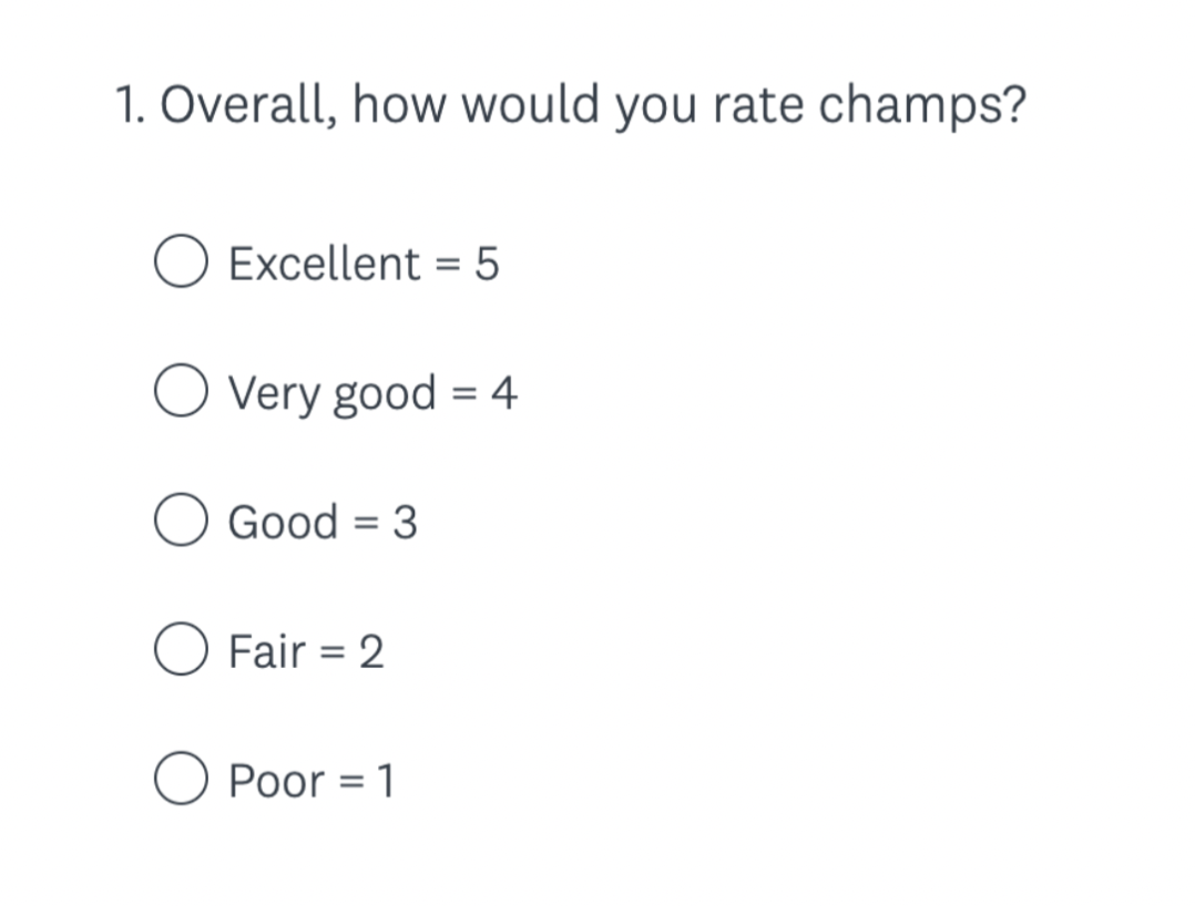
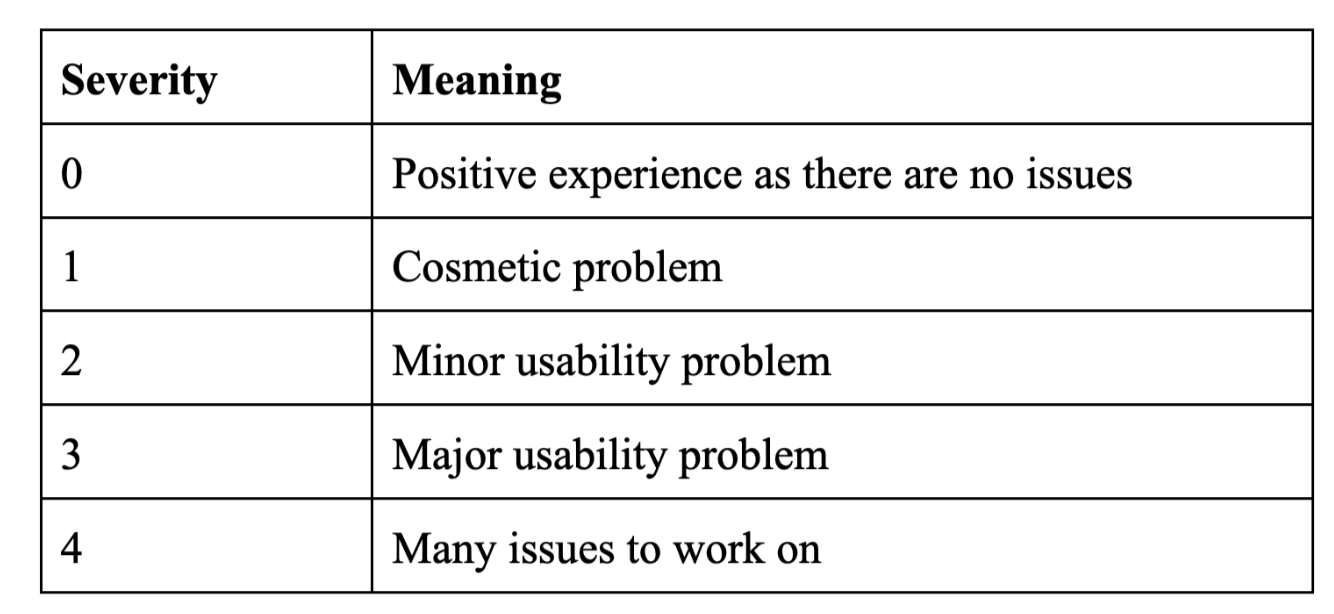
The observed results varied based on how the participants got confused
by the instruction, picking unlocked categories, and signing the right
word. 75% of participants clicked the locked button even though it was
darker than the unlocked button. For the log in, all the participants
seemed to understand what to do when logging in/creating an account.
Overall, the majority of participants enjoyed the concept and thought
it was a good idea to have an application to help hearing parents and
deaf children improve their relationship with each other.
In summary, we were able to take away valuable information regarding the design and the interface itself. From the testing, we were able to introduce our champs! application to the participants. Unexpectedly, we were able to collect all of the participants' opinions, feedback, and comments. The results from usability testing showed that there were some particular tasks the majority of the participants found confusing. We also learned that this application was not as intuitive as we thought it would be. If given the opportunity and more time, we would conduct more intensive testing and gather data to help us pinpoint and tackle the problems that we faced recently.